Note: This forum is merely an archive. It is no longer possible to register or post. - StackOverflow
New Ace of Spades Forums: http://buildandshoot.com/

Make the font easier to read and manage.

Got a great new idea for the game?

Make the font easier to read and manage.

Postby SeanEBlog » Sun Feb 12, 2012 10:30 am

As it stands, the font is just too hard to read. It either gets camouflaged by being the same color of the ground, or is simply too small. This also makes it problematic to complete votekicking. One time we just couldn't get enough votes to kick an obvious aimbot, I believe one of the main reasons is that the chat is being overlooked.
Image

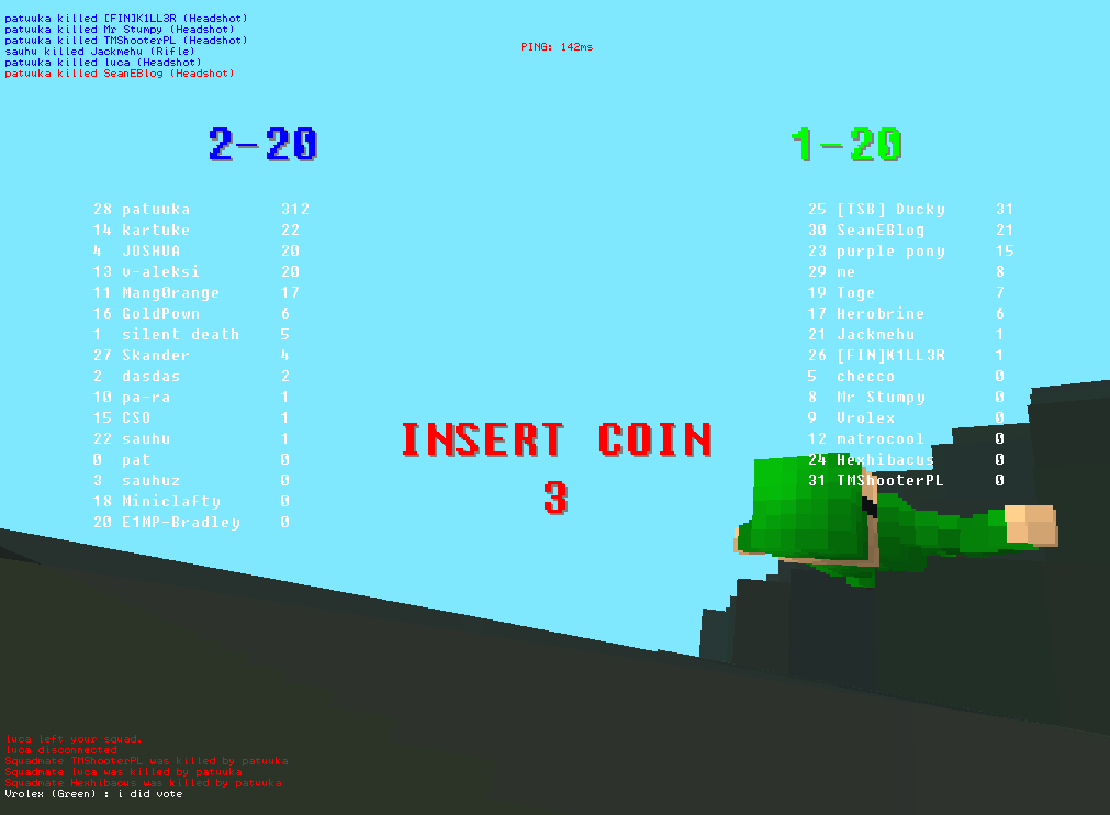
One font I want to suggest is Joxstix, which is free for commercial use, but wouldn't help with the camouflaging problem.

I also suggest the ability to use Page Up and Page Down to roll the chat log back and forth.
SeanEBlog
Member
 
Posts: 5
Joined: Sun Feb 05, 2012 6:15 am

Re: Make the font easier to read and manage.

Postby Gorman » Sun Feb 12, 2012 11:05 am

I have personally never had a problem with this, but fonts are easily customizable the same way guns and scopes are, the fonts are all bitmaps.
Image
User avatar
Gorman
[LDR] Member
 
Posts: 1170
Joined: Sat Dec 10, 2011 9:10 pm

Re: Make the font easier to read and manage.

Postby Squeal » Sun Feb 12, 2012 12:41 pm

Would putting something like a white outline on text make things much easier?
User avatar
Squeal
Member
 
Posts: 64
Joined: Thu Jan 26, 2012 11:10 pm

Re: Make the font easier to read and manage.

Postby SeanEBlog » Mon Feb 13, 2012 1:21 am

Gorman wrote:I have personally never had a problem with this, but fonts are easily customizable the same way guns and scopes are, the fonts are all bitmaps.


Could you post a guide on the conventions to follow when making font bitmaps? Also, would I have to install the font, or would I just swap out an existing font?
SeanEBlog
Member
 
Posts: 5
Joined: Sun Feb 05, 2012 6:15 am

Re: Make the font easier to read and manage.

Postby Gorman » Mon Feb 13, 2012 4:16 am

SeanEBlog wrote:
Gorman wrote:I have personally never had a problem with this, but fonts are easily customizable the same way guns and scopes are, the fonts are all bitmaps.


Could you post a guide on the conventions to follow when making font bitmaps? Also, would I have to install the font, or would I just swap out an existing font?

Go to \Ace of Spades\fonts and you will understand :P

I havn't swapped them out myself (like I said I don't have a problem with them), but it is just as straight forward as replacing a scope image etc.
Image
User avatar
Gorman
[LDR] Member
 
Posts: 1170
Joined: Sat Dec 10, 2011 9:10 pm

Re: Make the font easier to read and manage.

Postby SeanEBlog » Tue Feb 14, 2012 5:49 am

I can't find the font that's used for ingame chat in the fonts folder. Every bmp I swap out seems to be for something else.
SeanEBlog
Member
 
Posts: 5
Joined: Sun Feb 05, 2012 6:15 am

Re: Make the font easier to read and manage.

Postby me2005 » Tue Feb 14, 2012 8:48 pm

YES. To make things worse, I'm color blind, so the green/red text and the ground often get mixed up. A contrasting drop shadow or outline would be great.
me2005
Member
 
Posts: 3
Joined: Mon Feb 06, 2012 10:10 pm

Re: Make the font easier to read and manage.

Postby lolpwned23 » Tue Feb 14, 2012 9:41 pm

I agree and the green team chat can be so freaking hard to read sometimes...
(V)(;,,;)(V) whoopwhoopwhoopwhoopwhoop
User avatar
lolpwned23
Member
 
Posts: 131
Joined: Thu Jan 12, 2012 1:10 am
Location: Pickerington ohio

Re: Make the font easier to read and manage.

Postby xEric » Tue Feb 14, 2012 10:47 pm

Aim at something darker than the text to read it.
Back
User avatar
xEric
Member
 
Posts: 1254
Joined: Wed Feb 01, 2012 11:59 pm
Location: NC, Greensboro.

Re: Make the font easier to read and manage.

Postby asdfzxc » Wed Feb 15, 2012 3:23 am

Easy fix for this would be to give the scoreboard, chat box and kill feed a shaded background for contrast.
asdfzxc
Member
 
Posts: 16
Joined: Tue Dec 27, 2011 7:04 pm

Re: Make the font easier to read and manage.

Postby Tigershield » Wed Feb 15, 2012 11:03 pm

Green team chat is mostly fine,but on green maps its harder.Blue teamchat is very hard to read.
slow is smooth, smooth is fast
User avatar
Tigershield
Member
 
Posts: 334
Joined: Thu Jan 12, 2012 7:47 pm

Re: Make the font easier to read and manage.

Postby Gorman » Thu Feb 16, 2012 12:17 am

Putting a semi-transparent black background behind the chat feed (as many games do) would fix this.
Image
User avatar
Gorman
[LDR] Member
 
Posts: 1170
Joined: Sat Dec 10, 2011 9:10 pm


Return to Game


Who is online

Users browsing this forum: No registered users and 4 guests

cron